Precision in Practice: Navigating Usability Studies
Conducting a successful usability study, particularly for summative validation of medical products, can require a great deal of preparation and coordination of many moving parts. Whether it’s successfully simulating your target use environment or nailing down the exact scenarios and tasks to be presented, everything must come together. After all, nobody wants to waste the time and money it requires to complete a study if the result doesn’t align with what was intended.
One of the best ways to ensure success is to perform a pilot study with your protocol before starting the actual study. A pilot study is like a miniature version of the actual study conducted with far fewer participants. This approach helps confirm the study design will work as expected, the desired data can be obtained, the participants understand the task prompts, and more. For best results, the pilot study participants should be as close to actual participants as feasible; the same applies to the use environment. You’ll also want to conduct the pilot study early enough before the actual study to ensure there is sufficient time to update the protocol according to the findings.
Many people use the terms “dry run” and “pilot study” interchangeably, but there is technically a difference. A dry run is done to practice the protocol both before the pilot study and after the finalization of the protocol, ensuring the moderator and notetaker/analyst are comfortable with the product and script. This activity can be done with proxy participants or with no participants at all. What’s notable about a dry run is that it can be done in place of a pilot study if the participant population is expensive or difficult to recruit, if the protocol is very simple or essentially a repeat of a previous study, or if the timing does not permit a full pilot study.
While there can never be guarantees, these are proven ways to exponentially increase the odds of a study’s success. Taking the time upfront will ultimately save time and effort when it’s time to conduct the actual study. At Kaleidoscope, we've conducted hundreds of studies, so our process is as rigorous and dialed in as possible. If you're looking for a rock-solid research partner, we're ready to roll up our sleeves.
Inspired by Don Norman’s classic work, the Design of Everyday Things, we’ve been thinking about mundane, everyday items that can have annoying usability flaws. While we have a particular focus on the human factors of healthcare and medical products here at Kaleidoscope, we can apply that same rigorous, analytical human factors approach to these everyday things.
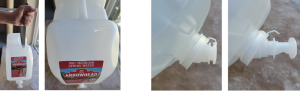
So, here we have the seemingly benign 2.5 gallon jug of drinking water, a household staple used by a variety of brands across the country.
Problem 1: As water is dispensed from the jug, additional air is required to replace the dispensed water to ensure consistent water flow and prevent the jug from collapsing due to the pressure of the surrounding air. To add air flow into the jug, a small hole must be punctured into top with a sharp knife. The use of a sharp knife poses a potential safety hazard when considering the orientation and motion in which the knife must be used and the force necessary for the knife to puncture the slick plastic material of the jug. In addition, the most obvious place to puncture this hole is the top side facing the front of the jug, which has a slight slant toward the user. The angle of the stabbing motion must be just right; if the angle is too shallow, the knife blade can skid across the surface of the plastic, with the blade pointing in toward the user’s body.
A potential mitigation for this problem is to provide an adhesive pull tab that can be removed to reveal a pre-punctured vent hole.
Problem 2: The spigot contains a small strip of plastic that extends from the spigot base to the dispenser handle. The plastic strip is intended to prevent the dispenser handle from being pulled open until the user intentionally breaks the strip, pulls the dispenser handle, and begins dispensing the water. However, the plastic strip can be easily broken unintentionally, and the dispenser handle then opens with very little resistance. This can lead to the dispenser handle opening inadvertently when force is applied to the spigot during loading, or the spigot catches on a surface while unloading, potentially emptying water into a shopping cart or the trunk of a car.
A potential mitigation for this problem is to provide a screw cap over the spigot, similar to the caps on water bottles.
What’s an aspect of an everyday item that you would change to improve the user experience?
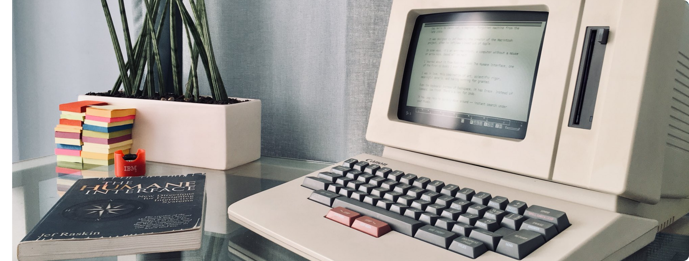
While “User Experience Design” is often used interchangeably with “User Interface Design,” UX goes far beyond mere interface design to encompasses a user’s complete experience of a product, system or service. For Don Norman, the usability engineer and researcher who coined the term “User Experience,” all aspects of the product experience, “from initial intention to final reflections,” ought to support the user’s needs and desires. Years before Norman came onto the scene, this same concept inspired Jef Raskin, a human-computer interface expert, to define the ideal computing system. Though his vision of a computer, which was nothing more than a glorified word processor, was uninspired even in its own time, Raskin developed a set of UX Design principles, including UI consistency and encouraging users to develop productive habits, that are still relevant today.
“The Canon Cat and the Mac that Steve Jobs Killed,” an article by Matthew Guay, describes Raskin’s desire to create a computer with a humane interface. “An interface (i.e. ‘The way that you accomplish tasks with a product’) is humane if it is responsive to human needs and considerate of human frailties,” wrote Raskin. His goal was to liberate computer users through increased productivity—getting more done in less time. Inspired by Isaac Asimov’s laws of robots, Raskin defined his own laws of computing to achieve this goal:
“A computer shall not harm your work or, through inaction, allow your work to come to harm.
“A computer shall not waste your time or require you to do more work than is strictly necessary.”
Raskin’s second law is applicable far beyond word processing and seems to emphasize a common struggle faced by UX and UI designers alike. Powerpoint is a notable example of a poorly designed interface that results in decreased productivity. Its predictive toolbar feature that attempts to anticipate the user’s needs based on what has been selected. While this feature can be helpful when it correctly predicts the user’s needs, it can be very inconvenient when it guesses incorrectly, adding multiple mouse clicks to the user’s workflow.
Another violation of Raskin’s second law is inconsistency between user interface elements. Consider Apple’s latest iOS update. Previously, incoming text messages appeared at the top of the lock screen. Following the 16.1.1 update, incoming text messages now appear at the bottom of the lock screen. Neither location is objectively right or wrong, except for the user’s previous experiences of seeing new messages at the top. Now users must unlearn a previous habit to relearn a new interaction. Does the new feature add sufficient value to be worth the friction it introduces into the user’s experience?
The quintessential mnemonic “righty tighty lefty loosey” illustrates the socially ingrained understanding of how to lock or unlock a rotating mechanism. This convention becomes apparent when a user encounters an experience that is counter to what they expect. Because a user intuitively expects to turn the mechanism a certain way, requiring the opposite is a source of confusion and frustration.
When designing products, consistency is one of many usability principles, known as heuristics, that act as general guidelines for creating intuitive user interactions. Usability expert Jakob Neilsen, who cofounded the Nielsen-Norman Group with our good friend Don Norman, created the most well-known and widely used set of usability heuristics. These heuristics are used by product designers across the globe to design more intuitive and user-friendly products and experiences.
Another key heuristic that Nielsen defined is the user’s ability to match the design of the system to their understanding of the real world. Imagine a stove top with 4 burners arranged in a square and knobs that are arranged in a line. This creates confusion and tension because the user does not know which knob controls which burner. However, if the knobs are arranged in the same square pattern as the burners, and each knob activates its corresponding burner, users quickly understand which knob needs to be turned to ignite the intended burner.
The ultimate goal of user-centered design is to increase productivity and create an experience that is “responsive to human needs and considerate of human frailties.” No product is experienced in a vacuum—each user encounters that product within the context of a lifetime of other experiences. Understanding the needs and frailties of the end user empowers designers to create more intuitive, efficient, and enjoyable experiences for users. While Jef Raskin’s Canon Cat was a commercial failure, in a world inundated with widgets, tools and systems—both physical and digital—his concept of a humane interface is perhaps more relevant now than ever.
About:
Headquartered in Cincinnati, Ohio, Kaleidoscope Innovation provides medical, consumer, and industrial clients with full-service insights, design, human factors, and product development. For more than 30 years we have been helping our clients grow their capabilities, gain usable knowledge, and get worthwhile results.
As a full-spectrum product design and development firm, we are an expert extension of your product vision. Our teams collaborate across disciplines, providing specialized input to produce the ideal intersection between function and form. To ensure the soundness of our work, Kaleidoscope houses a full range of test labs, and we employ an award-winning team that embraces every challenge, applying their experience, ingenuity, and passion.
Tom Gernetzke is a senior lead industrial designer at Kaleidoscope Innovation and has spent the last 12 years creatively bringing new product ideas to life.


 |
|