Usability Check: The Bandage Battle You Didn’t Know You Needed

Everyone has used an adhesive bandage, but which one is your favorite? Have you ever stopped to think about why? Bandage usability has real implications for patient care, safety, and user satisfaction. In this article, we examine how packaging, adhesive, and design choices impact the experience for end users.

Although adhesive bandages are typically classified as Class I medical devices by the Food and Drug Administration (FDA), that doesn't mean usability is unimportant. Think about the last time you used one: Were you in pain? In a rush? Maybe trying to open and apply it with one hand? These are the kinds of real-world conditions that highlight the importance of thoughtful design. To demonstrate that human factors can be applied to even the simplest of devices, we evaluated the usability of four different bandages that can be found in any local drugstore.


The Bandages

We chose four different adhesive bandages to compare. These bandages were chosen for their brand recognition and variability in shape, size, and material type.

  1. Band-Aid - Flexible Fabric Knuckle & Fingertip Bandages, H-shape
  2. Niceful - Silicone Foam Dressing Gentle Border, square shape
  3. Nexcare - Waterproof Clear Bandages, hexagon shape
  4. Welly - Adhesive Flexible Fabric Bravery Badges, oval shape

Each bandage was evaluated based on key features and usability considerations, including the texture and flexibility of the fabric, the ease of removing the liner and applying the bandage, and the clarity of the instructions, labeling, and overall packaging design.


Methods and Results

In June 2025, 2 Human Factors Engineers (HFEs) from Kaleidoscope Innovation, Rebecca Chompff and Taylor Morgan, performed a systematic evaluation of 4 bandages and 10 key bandage features essential for successful and satisfactory use.

The usability of each bandage was discussed on a feature-by-feature basis. Each feature was subjectively rated on a scale from 0 to 4, where 0 = Not Applicable, 1 = Poor, 2 = Okay, 3 = Good, and 4 = Great.

The 10 key bandage features that were assessed included:

  • package labeling,
  • unboxing,
  • wrapper,
  • unwrapping,
  • material,
  • adhesive,
  • application,
  • a 72-hour leave-on test,
  • and removal post leave-on test.

The table below displays the subjective ratings for each bandage and bandage feature assessed during this evaluation:

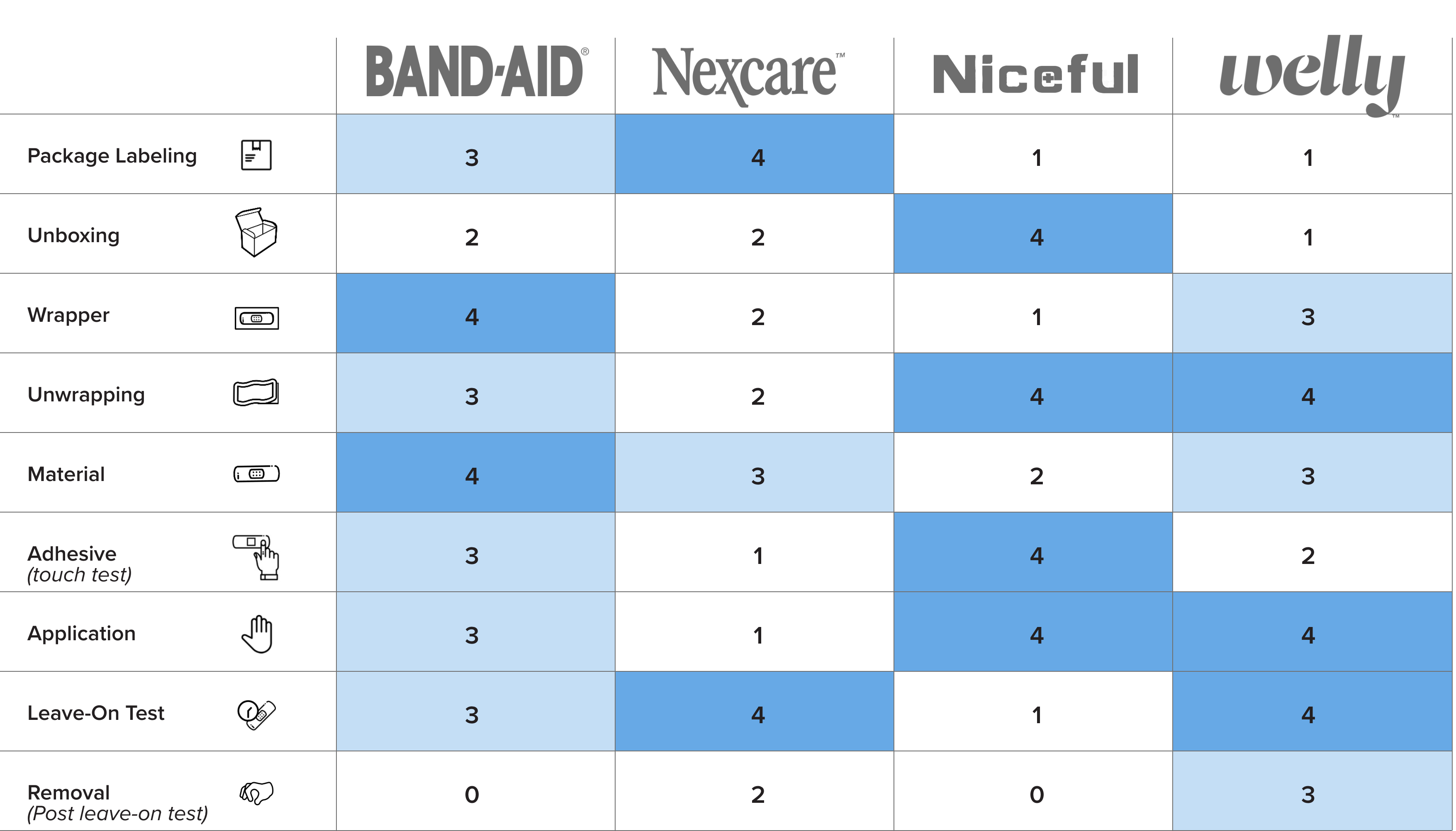
The adhesive bandage(s) rated the highest and lowest for each key feature are discussed below:

  • Package Labeling refers to all text and visuals displayed on the bandage container and was evaluated for its usability. Nexcare earned the highest score (4) for its clear and informative labeling, featuring concise text, large graphics, well-organized layout, and user-friendly “Easy to Apply” instructions printed on the side of the box. In contrast, Niceful and Welly received the lowest score (1). Niceful was marked down for its lengthy paragraphs and the use of medical terminology, such as “absorb exudate quickly,” which could be important for healthcare professionals but may confuse lay users. Welly scored poorly due to minimal information and prioritization of kid-friendly colors over clarity. Most of the information was printed on a disposable paper wrapper around the tin container, which has to be removed, and likely discarded, before use.

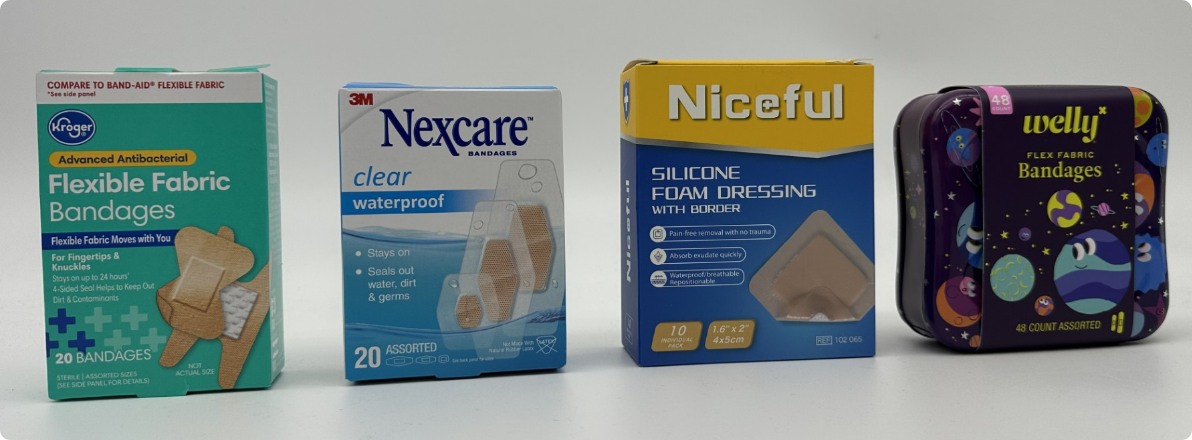
Figure 1. Bandage Packages – Left to right: Band-Aid, Nexcare, Niceful, Welly

  • 4Unboxing refers to the process of opening the new container to access the bandages inside. Niceful received the highest score (4) for its adhesive safety seal, which includes a pull tab sticker that aids the user in opening the box. Welly earned the lowest score (1) due to the absence of clear instructions or indicators on how to open the tin or identify its top side. Opening the Welly lid also required significant force, causing some bandages to fall out.
  • Wrapper refers to the sealed paper or plastic covering of each individual bandage. Band-Aid received the highest score (4) for its paper wrapper, which features a “peel here” label printed on a prominent red bar next to the pull tabs. In contrast, Niceful received the lowest score (1) due to its oversized plastic wrapper, which creates unnecessary waste and lacks clearly identifiable pull tabs.

Figure 2. Wrapped Bandages – Left to right: Band-Aid, Nexcare, Niceful, Welly

  • Unwrapping refers to the process of opening the sealed paper or plastic covering each bandage. Niceful and Welly received the highest score (4) for their user-friendly design, featuring large peel tabs and wrappers that separated easily. Nexcare received the lowest score (2) because its wrapper was somewhat difficult to pull apart and often tore irregularly during opening. No bandage received a score of 1 in this category.

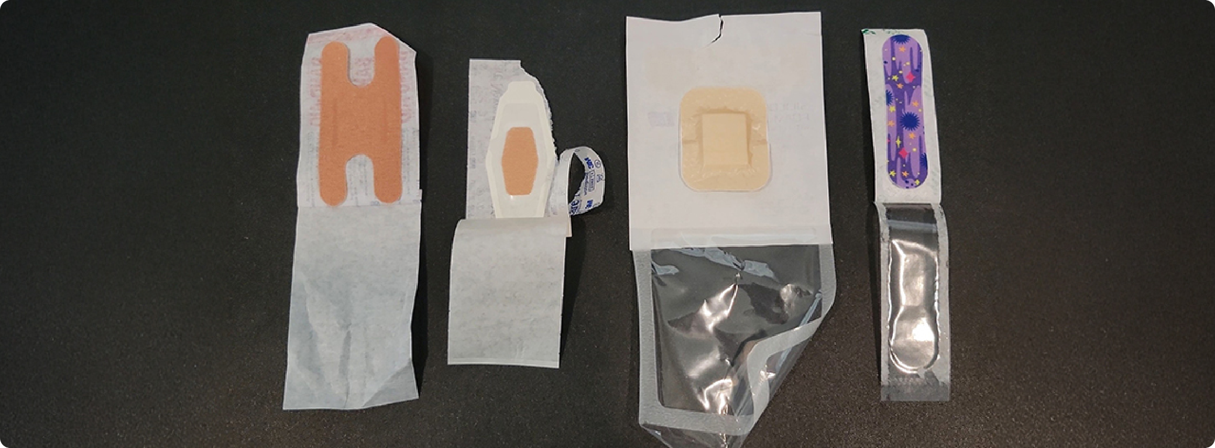
Figure 3. Unwrapped Bandages – Left to right: Band-Aid, Nexcare, Niceful, Welly

  • Material refers to the surface of the bandage opposite the adhesive liner. Band-Aid earned the highest score (4) for its smooth, soft, and comfortable texture, along with the ability to stretch and conform to the body. Niceful received the lowest score (2) due to its slick plastic texture, which felt soft but less pleasant to the touch. No bandage received a score of 1 in this category.
  • Adhesive refers to the sticky side of the bandage that adheres to the skin and was assessed by fingertip touch. Niceful received the highest score (4) for its sticky adhesive, which continued across the absorbent pad, indicating that the bandage would stay securely in place for the duration of wear. Nexcare received the lowest score (1) due to its lack of stickiness, which raised concerns about its ability to remain adhered to the skin.
  • Application refers to the process of placing a bandage onto the skin—in our case, along the forearm. Niceful and Welly received the highest scores (4) for smooth application and visible adherence to both hairy and non-hairy skin. Nexcare received the lowest score (1) because proper application required careful attention to the performance of the application steps, particularly involving peeling individual border pieces from the bandage. The Nexcare bandage also requires more pressure to seal properly and showed poor adhesion on hairy skin.

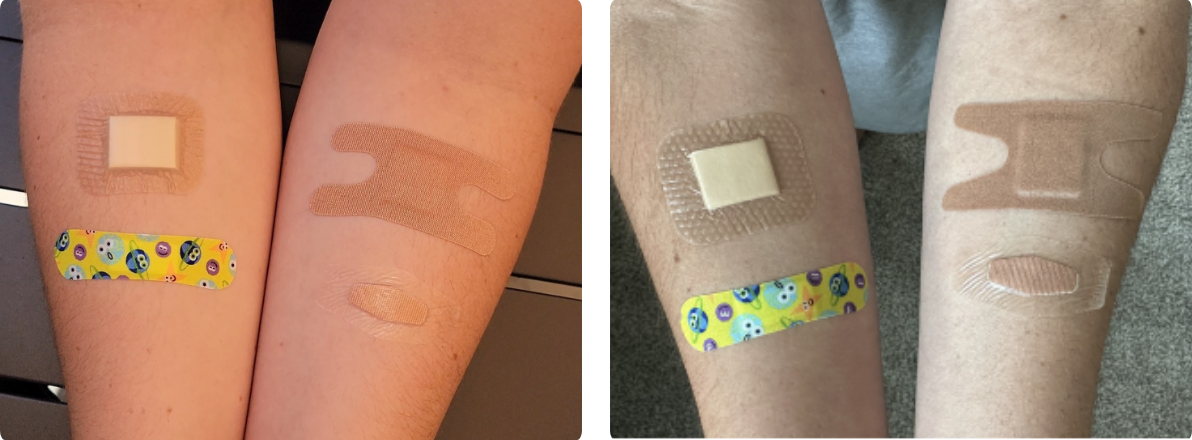
Figure 4 +5. All bandages immediately following application

  • Leave-On Test refers to a trial involving two researchers wearing each of the four bandages continuously on their forearms for 72 hours. During this period, both researchers took three showers, completed two workouts, and were exposed to average outdoor temperatures of 85°F. Nexcare and Welly received the highest score (4) for maintaining strong adhesion throughout the full 72 hours. Niceful received the lowest score (1) as it detached after just 6 hours for one researcher and 19 hours for the other—both shortly after their first shower. For one of the researchers, Band-Aid detached after their second shower, approximately 30 hours after application.

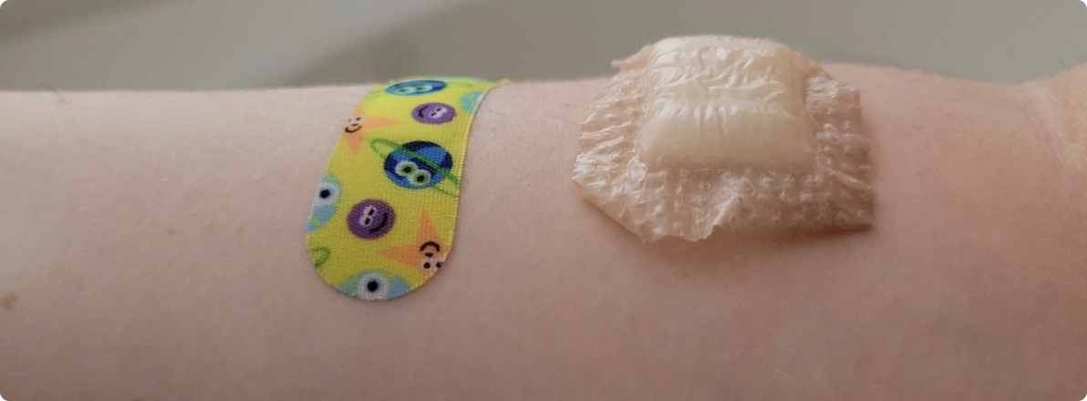
Figure 6. Niceful bandage (right), 19 hours after application and moments before it detached

  • Removal (post leave-on test) refers to the process of taking off the bandage after the 72-hour wear period described above. Notably, no bandage received a perfect score of 4 in this category. Welly received the highest score (3) for this removal, as it caused only minimal discomfort. Band-Aid received the lowest score (0) because one researcher experienced the bandage detaching after just 30 hours so it could not be fairly compared to the other bandages that adhered for the full 72-hours. Niceful also received the lowest score (0), as both researchers reported the bandage falling off prematurely—after 6 and 19 hours, respectively.


Final Thoughts

This evaluation has made clear that even though these bandages initially seem very similar, they each have specific strengths and weaknesses. The Band-Aid bandage wrapper has easily identifiable instructions for opening, and the bandage material feels comfortable and smooth on the skin. The Nexcare bandage packaging has the most user-friendly labeling and maintained a strong adherence to the skin for the entire 72-hour leave-on test. The Niceful bandage package was easy to open and unwrap, felt stickiest during the adhesive touch test, could be applied with minimal difficulty, and did not hurt during immediate removal. The Welly bandage was easy to unwrap, could be applied with minimal difficulty, and maintained a strong adherence to the skin for the entire 72-hour leave-on test.

With these considerations in mind, here are our final bandage recommendations:

  • Best for kids: Welly
  • Pain free removal: Niceful
  • Best longevity: Nexcare or Welly
  • Best comfort: Band-Aid or Welly
  • Most waterproof: Nexcare
  • Overall favorite: Welly! The endearing designs, comfort, and longevity of wear made the Welly bandage our overall favorite.

Next time you’re at the store picking out adhesive bandages, remember these considerations to help you choose the best one for your needs.

Back to Insights + News

Authors

  • Rebecca Chompff

    Senior Human Factors Engineer | [email protected]

    Rebecca Chompff is a Senior Human Factors Engineer at Kaleidoscope Innovation. With a background in Psychology and Human Factors Engineering, she is dedicated to translating real-world user insights into actionable design improvements that enhance both usability and user satisfaction. Driven by empathy and evidence, Rebecca ensures every design decision reflects the needs and experiences of the people who actually use it.

  • Taylor Morgan

    Human Factors Engineer | [email protected]

    Taylor is a Human Factors Engineer at Kaleidoscope Innovation. She brings experience from roles in Human Factors, Research and Design, and Clinical Research. Her background in Human Factors Engineering, combined with her collaborative approach, ensures that user-centered design is seamlessly integrated into every project.

Precision in Practice: Navigating Usability Studies

Conducting a successful usability study, particularly for summative validation of medical products, can require a great deal of preparation and coordination of many moving parts. Whether it’s successfully simulating your target use environment or nailing down the exact scenarios and tasks to be presented, everything must come together. After all, nobody wants to waste the time and money it requires to complete a study if the result doesn’t align with what was intended.

One of the best ways to ensure success is to perform a pilot study with your protocol before starting the actual study. A pilot study is like a miniature version of the actual study conducted with far fewer participants. This approach helps confirm the study design will work as expected, the desired data can be obtained, the participants understand the task prompts, and more. For best results, the pilot study participants should be as close to actual participants as feasible; the same applies to the use environment. You’ll also want to conduct the pilot study early enough before the actual study to ensure there is sufficient time to update the protocol according to the findings.

Many people use the terms “dry run” and “pilot study” interchangeably, but there is technically a difference. A dry run is done to practice the protocol both before the pilot study and after the finalization of the protocol, ensuring the moderator and notetaker/analyst are comfortable with the product and script. This activity can be done with proxy participants or with no participants at all. What’s notable about a dry run is that it can be done in place of a pilot study if the participant population is expensive or difficult to recruit, if the protocol is very simple or essentially a repeat of a previous study, or if the timing does not permit a full pilot study.

While there can never be guarantees, these are proven ways to exponentially increase the odds of a study’s success. Taking the time upfront will ultimately save time and effort when it’s time to conduct the actual study. At Kaleidoscope, we've conducted hundreds of studies, so our process is as rigorous and dialed in as possible. If you're looking for a rock-solid research partner, we're ready to roll up our sleeves.

Back to Insights + News

Author

The Design of Everyday Things

Inspired by Don Norman’s classic work, the Design of Everyday Things, we’ve been thinking about mundane, everyday items that can have annoying usability flaws. While we have a particular focus on the human factors of healthcare and medical products here at Kaleidoscope, we can apply that same rigorous, analytical human factors approach to these everyday things.

So, here we have the seemingly benign 2.5 gallon jug of drinking water, a household staple used by a variety of brands across the country.

Problem 1: As water is dispensed from the jug, additional air is required to replace the dispensed water to ensure consistent water flow and prevent the jug from collapsing due to the pressure of the surrounding air. To add air flow into the jug, a small hole must be punctured into top with a sharp knife. The use of a sharp knife poses a potential safety hazard when considering the orientation and motion in which the knife must be used and the force necessary for the knife to puncture the slick plastic material of the jug. In addition, the most obvious place to puncture this hole is the top side facing the front of the jug, which has a slight slant toward the user. The angle of the stabbing motion must be just right; if the angle is too shallow, the knife blade can skid across the surface of the plastic, with the blade pointing in toward the user’s body.

A potential mitigation for this problem is to provide an adhesive pull tab that can be removed to reveal a pre-punctured vent hole.

Problem 2: The spigot contains a small strip of plastic that extends from the spigot base to the dispenser handle. The plastic strip is intended to prevent the dispenser handle from being pulled open until the user intentionally breaks the strip, pulls the dispenser handle, and begins dispensing the water. However, the plastic strip can be easily broken unintentionally, and the dispenser handle then opens with very little resistance. This can lead to the dispenser handle opening inadvertently when force is applied to the spigot during loading, or the spigot catches on a surface while unloading, potentially emptying water into a shopping cart or the trunk of a car.

A potential mitigation for this problem is to provide a screw cap over the spigot, similar to the caps on water bottles.

What’s an aspect of an everyday item that you would change to improve the user experience?

Back to Insights + News

Author

Designer Centered Design: Humane Design

While “User Experience Design” is often used interchangeably with “User Interface Design,” UX goes far beyond mere interface design to encompasses a user’s complete experience of a product, system or service. For Don Norman, the usability engineer and researcher who coined the term “User Experience,” all aspects of the product experience, “from initial intention to final reflections,” ought to support the user’s needs and desires. Years before Norman came onto the scene, this same concept inspired Jef Raskin, a human-computer interface expert, to define the ideal computing system. Though his vision of a computer, which was nothing more than a glorified word processor, was uninspired even in its own time, Raskin developed a set of UX Design principles, including UI consistency and encouraging users to develop productive habits, that are still relevant today.

“The Canon Cat and the Mac that Steve Jobs Killed,” an article by Matthew Guay, describes Raskin’s desire to create a computer with a humane interface. “An interface (i.e. ‘The way that you accomplish tasks with a product’) is humane if it is responsive to human needs and considerate of human frailties,” wrote Raskin. His goal was to liberate computer users through increased productivity—getting more done in less time. Inspired by Isaac Asimov’s laws of robots, Raskin defined his own laws of computing to achieve this goal:

“A computer shall not harm your work or, through inaction, allow your work to come to harm.

“A computer shall not waste your time or require you to do more work than is strictly necessary.”

Raskin’s second law is applicable far beyond word processing and seems to emphasize a common struggle faced by UX and UI designers alike. Powerpoint is a notable example of a poorly designed interface that results in decreased productivity. Its predictive toolbar feature that attempts to anticipate the user’s needs based on what has been selected. While this feature can be helpful when it correctly predicts the user’s needs, it can be very inconvenient when it guesses incorrectly, adding multiple mouse clicks to the user’s workflow.

Another violation of Raskin’s second law is inconsistency between user interface elements. Consider Apple’s latest iOS update. Previously, incoming text messages appeared at the top of the lock screen. Following the 16.1.1 update, incoming text messages now appear at the bottom of the lock screen. Neither location is objectively right or wrong, except for the user’s previous experiences of seeing new messages at the top. Now users must unlearn a previous habit to relearn a new interaction. Does the new feature add sufficient value to be worth the friction it introduces into the user’s experience?

The quintessential mnemonic “righty tighty lefty loosey” illustrates the socially ingrained understanding of how to lock or unlock a rotating mechanism. This convention becomes apparent when a user encounters an experience that is counter to what they expect. Because a user intuitively expects to turn the mechanism a certain way, requiring the opposite is a source of confusion and frustration.

When designing products, consistency is one of many usability principles, known as heuristics, that act as general guidelines for creating intuitive user interactions. Usability expert Jakob Neilsen, who cofounded the Nielsen-Norman Group with our good friend Don Norman, created the most well-known and widely used set of usability heuristics. These heuristics are used by product designers across the globe to design more intuitive and user-friendly products and experiences.

Another key heuristic that Nielsen defined is the user’s ability to match the design of the system to their understanding of the real world. Imagine a stove top with 4 burners arranged in a square and knobs that are arranged in a line. This creates confusion and tension because the user does not know which knob controls which burner. However, if the knobs are arranged in the same square pattern as the burners, and each knob activates its corresponding burner, users quickly understand which knob needs to be turned to ignite the intended burner.

The ultimate goal of user-centered design is to increase productivity and create an experience that is “responsive to human needs and considerate of human frailties.”  No product is experienced in a vacuum—each user encounters that product within the context of a lifetime of other experiences. Understanding the needs and frailties of the end user empowers designers to create more intuitive, efficient, and enjoyable experiences for users. While Jef Raskin’s Canon Cat was a commercial failure, in a world inundated with widgets, tools and systems—both physical and digital—his concept of a humane interface is perhaps more relevant now than ever.

About:
Headquartered in Cincinnati, Ohio, Kaleidoscope Innovation provides medical, consumer, and industrial clients with full-service insights, design, human factors, and product development. For more than 30 years we have been helping our clients grow their capabilities, gain usable knowledge, and get worthwhile results.

As a full-spectrum product design and development firm, we are an expert extension of your product vision. Our teams collaborate across disciplines, providing specialized input to produce the ideal intersection between function and form. To ensure the soundness of our work, Kaleidoscope houses a full range of test labs, and we employ an award-winning team that embraces every challenge, applying their experience, ingenuity, and passion.

Back to Insights + News

Author

  • Tom Gernetzke

    Senior Industrial Designer | [email protected]

    Tom Gernetzke is a senior lead industrial designer at Kaleidoscope Innovation and has spent the last 12 years creatively bringing new product ideas to life.